Overview
This article provides a guide on how to create a dark mode toggle button in react with tailwindcss. This goes beyond how just basic dark mode works in tailwindcss, and we can actually build our own toggle and allow the user to select between dark and light mode.
The strategy I'm taking in this guide is controlling the light/dark mode state through a context. There's different ways to handle this state, but I've chosen using a context for this guide since it avoids prop drilling.
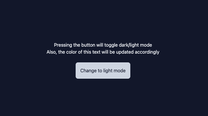
The end result is building the following demo. Screenshot:

How tailwindcss handles dark mode
By default, a tailwindcss application is in dark or light mode depending on the user's system preferences. Then we
can define styles for each mode as follows <div className="bg-slate-100 dark:bg-slate-900"></div>. In this line,
we're defining the background color for the div to be slate-100 in light mode and slate-900 in dark mode. Which one
will be used depends on the user's system preferences.
However, in order to build a dark/light mode toggle, we need to control whether we want the app to be light or dark mode.
This is done by changing the tailwindcss config to state that we want to use the class strategy (more on that below).
First, change tailwindcss config
Let's start off by changing tailwind.config.js to let tailwindcss know that we'll be controlling whether the app is in
dark or light mode.
This is all we have to add:
module.exports = {
  ...
  darkMode: "class",
};
Next, create the context
A context is how we will transfer state about whether the app is in dark or light mode. Typically, the
toggle button is deep down in the component tree, while for the class strategy we need to pass a class name of dark at the
root element of our app. To make this transfer of state easier, a context is used as it avoids prop drilling.
We can create the context as its own file with the following code:
import { createContext } from "react";

const ThemeContext = createContext({
  themeClass: null,
  setThemeClass: null,
});

export default ThemeContext;
This creates and exports a simple context with two fields, themeClass and setThemeClass. The themeClass field will be
either "dark" or "light" and the setThemeClass will be the setter for this value.
Handle context data at top layer
At the top level of our app, we'll create a state variable to hold the theme class and a setter for it. We'll use the
context to pass those values down through our app without prop drilling. We'll also add the dark class to the root element
if we are in dark mode. Doing so will activate the properties that are prepended with dark:.
This is what the top level of the app looks like in the demo:
import { useState } from "react";
import ThemeContext from "./ThemeContext";

const App = () => {
  const [themeClass, setThemeClass] = useState("light"); // change the default here

  return (
    <ThemeContext.Provider value={{ themeClass, setThemeClass }}>
      <div className={themeClass}>
        <div className="text-slate-900 bg-slate-100 h-screen flex justify-center items-center dark:text-slate-100 dark:bg-slate-900">
          <Content />
        </div>
      </div>
    </ThemeContext.Provider>
  );
};
Change context data through toggle
Finally we can add the logic to the button itself. We'll pull data from the context to determine the current theme class. We'll use that information to know what we should change to, and what the current text should be.
This is what the inner content looks like in the demo:
import { useContext } from "react";
import ThemeContext from "./ThemeContext";

const Content = () => {
  const { themeClass, setThemeClass } = useContext(ThemeContext);
  const isDarkMode = themeClass === "dark";

  const onHandleClick = () => {
    setThemeClass(isDarkMode ? "light" : "dark");
  };

  return (
    <div className="flex flex-col items-center">
      <div>Pressing the button will toggle dark/light mode</div>
      <div>Also, the color of this text will be updated accordingly</div>
      <button className="p-4 bg-slate-300 rounded-lg mt-6 text-slate-900" onClick={() => onHandleClick()}>
        Change to {isDarkMode ? "light" : "dark"} mode
      </button>
    </div>
  );
};

export default Content;
Conclusion
Now we can successfully toggle between dark and light mode. The end result is the demo mentioned above.
The text and background colors will change because of the dark: prefix styles we defined near the root of the app.
Anywhere in the app that we want to set styles for dark mode, we can use the dark: prefix. Otherwise the default will be light mode.